
OneAmerica Case Study
OneAmerica Case Study
Designing OneAmerica’s First Mobile Application
"Note: Some details have been generalized to respect confidentiality."
Snapshot
Company: OneAmerica Financial Partners
Domain: Retirement / Investments (Regulated FinTech)
Platform: iOS/Android (Mobile MVP)
My Role: Solo UX Designer (supported by UX Director)
Team: UI Designer · PM · Developers · External vendors (Infosys, DXC)
Outcome: Shipped the first mobile MVP that enabled retirement users to view account details and complete key actions with clearer navigation and accessibility-aware design.

Overview
OneAmerica is a mutual insurance holding company providing retirement, life insurance, and employee benefits services. This initiative focused on Retirement Services customers who lacked a mobile experience and were forced to manage accounts through multi-step web portals.
My role was to lead UX strategy and execution for OneAmerica’s first mobile application—from discovery and task definition to wireflows, prototyping, testing, and implementation support.
Problem Statement
Unlike key competitors, OneAmerica had no mobile app for Retirement Services users. Customers had to rely on outdated web portals to view balances, manage allocations, and complete transactions—creating friction, limiting engagement, and raising accessibility and compliance challenges.
The business needed a modern, intuitive mobile MVP that balanced usability with regulated requirements.


Users & Audience
Primary users
-
Retirement account holders managing 401(k) and related accounts
-
Users who want quick visibility into investments and performance
-
Plan sponsors needing timely access to plan/account information
Key user context
Mobile users are often checking quickly (on breaks, commuting, between meetings). The app needed high clarity and fast scanning, especially for financial terminology.
MVP scope
Top MVP tasks
-
Sign in securely and land on an account overview
-
View balance, performance, and allocation at a glance
-
Review recent activity / transactions
-
Take a core action (e.g., change contribution/allocation, initiate a transaction)
Manage alerts/notifications for important account events

Project Goals
Launch OneAmerica’s first mobile MVP for public use
Reduce friction across core “check + act” user flows
Simplify account visibility and key actions through strong information hierarchy
Ensure ADA/accessibility awareness and stakeholder alignment in a regulated environment
My Responsibilities
As the only UX Designer on the project (supported by a UX Director), I:
-
Conducted market research and competitive analysis (Fidelity, Vanguard, Principal)
-
Created user journeys and wireflows across dashboards, transactions, and alerts
-
Designed low-fidelity → high-fidelity prototypes and facilitated usability testing
-
Delivered annotated designs and accessibility-aware specs for vendor implementation
-
Partnered in agile ceremonies (sprint planning, reviews) and supported QA on implemented designs
User Experience Process


Key Design Decisions
Results & Impact
-
Successfully launched OneAmerica’s first mobile app MVP
-
Improved clarity of navigation and key tasks through tested information hierarchy and flow simplification
-
Delivered accessible, annotated designs that supported vendor implementation and reduced handoff ambiguity
How we knew
-
Prototype testing and stakeholder reviews validated navigation clarity and reduced confusion before build
-
QA/design reviews ensured the final experience matched approved designs
Key Takeaways
-
Solo UX doesn’t mean working alone—cross-functional alignment drove speed and clarity
-
Regulated environments require early coordination with stakeholders and careful content decisions
-
Early prototyping/testing reduced rework and improved confidence before implementation
Prototyping And User Flows
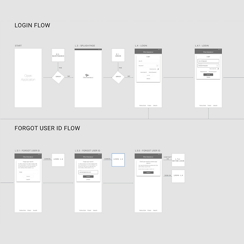
Sometimes low fidelity can be mistaken for the final product.
I was able to complete and contribute to journey mapping, user flows, low fidelity designs and high fidelity prototyping. The breakdown to this was to:
-
Create User flows and wire-flows for interactive pieces and mapping out all possible paths. Wire-flows were used to give a visual aid on different paths of the application.
-
Create Low Fidelity Prototypes for quick design reviews. This is a great way to kick out screens and even functionality for the team.
-
Create Interactive High Fidelity Prototypes. This would help finalize designs and even be utilized for iterating through user testing for improvement of screens.
-
Lead and Validate ADA compliance was implemented while designing and developing the application. This included ADA Validation and Providing ADA annotations for vendors.
-
Utilize user testing for improving design and improving user experience make the app user friendly as well as intuitive. Testing screens and even testing flows.
-
Go through sprint planning to see what work will be done as well as meet with BA and UI Designer to walk through processes.
Sample Gallery of Low Fidelity
I wanted to share a few screenshots with you on some of the designs that were in the works.


